ANALYTICS
Posted by 1 1 onOn the analytics interface you can gather information on your screens performance and behavior.
Filtering
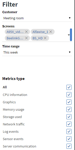
Customer
Users with a Super Administrator role are able to select from all customers. Filtering by customer will reduce the options of screens you can choose from. Users with other roles can only choose screens from the customer they are bound to.
Screens
Selected screens will be added to the Analytics view. In the selected drop-down you can select multiple screens at once.
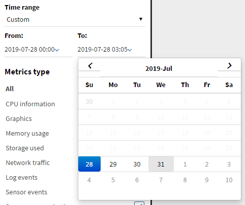
Time range
You can either choose from predefined time ranges in the selected drop-down or select the ‘Custom’ option which will reveal a datapicker interface for more specific filtering.
Metrics type
Metrics are grouped by type. You can choose from the following metric types to display for each screen:
- CPU information
- usage
- load – last 1 minute
- load – last 5 minute
- temperature
- number of threads
- number of processes
- Graphics
- frames per second
- Memory usage
- memory used by the system
- memory used by virtual machines
- memory used by the application
- Storage usage
- used storage – usage of the storage where files are cached
- downloaded cached file count
- downloaded cached unique file count
- Network traffic
- application network RX
- application network TX
- system network RX
- system network TX
- request count – last 15 minutes
- Log events
- error log count – last 1 minute
- warn log count – last 1 minute
- info log count – last 1 minute
- Sensor events
- sensor event count
- Server communications
- server request execution time average – last 1 minute
- response time from server – last 1 minute
Note: Each client application has limits on which metrics data can be collected on the specific hardware.
Analytics view
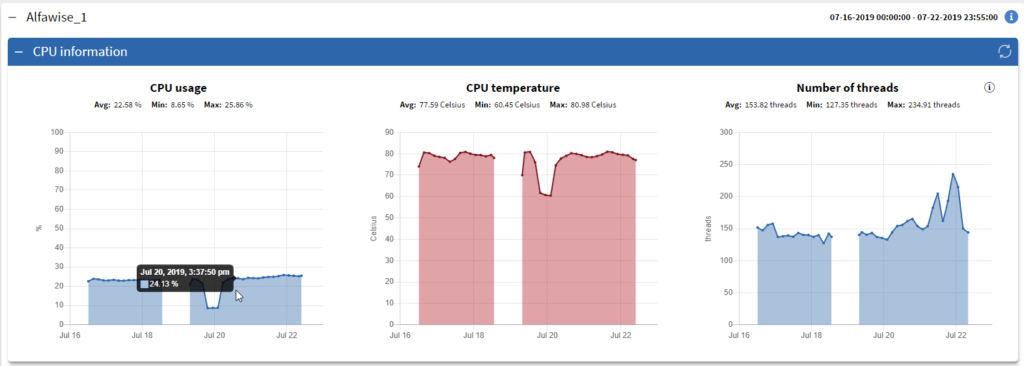
In the Analytics view each device has a collapsible panel containing the metric types and graphs. Re-opening panels will refresh graphs just as well as the refresh button. Points in graphs represent an average based on the size of the time range. Shorter time intervals will provide more accurate metrics. Graphs display an overall average, maximum, minimum, and summarized value.
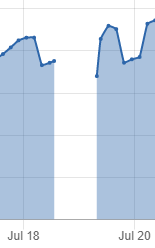
No data intervals
Gaps will appear in the graphs if there are intervals where the device did not upload data. This can either mean the device was offline or a malfunction happened when collecting or uploading the data.
Graph coloring
Some graphs have an initial color for better understanding.
- error log count – red
- warn log count – yellow
- info log count – green
On other graphs coloring is used to get the users attention. When the average value passes the warn or error limit of the metric warning colors will be applied to the graph.
- error color – red
- warn color – yellow
Warning limits on specific metrics:
- cpu usage
- warn limit: average value is above 70 %
- error limit: average value is above 85 %
- cpu temperature
- warn limit: average value is above 60 °C
- error limit: average value is above 75 °C
- frames per second
- warn limit: average value is under 30 fps
- error limit: average value is under 24 fps
- memory used by the system
- warn limit: average value is above 70 % of the memory
- error limit: average value is above 85 % of the memory
- used storage
- warn limit: average value is above 70 % of the storage space
- error limit: average value is above 85 % of the storage space
- server response time
- warn limit: average value is above 100 ms
- error limit: average value is above 300 ms