METER WIDGET
Posted by 1 1 on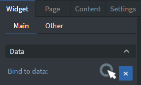 |
You can use the Bind to data tool to select your Datasource.
See more about: Data binding. |
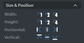 |
In the Size & Position Menu you can select the width, height, and placement of your widget quickly.
See more specified information about: Size&Position. |
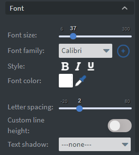 |
In the Font Menu you can set the size, family, style, and color of the font. You can also set letter spacing, shadow, and custom line height to your widget here. See more specified information about: Using font. |
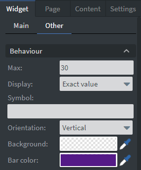 |
In the Behavior Menu you can set the value directly as well as the maximum value without a datasource.
If you select the exact value display format you can set a symbol to display next to the value. You can also select the orientation, the background, and bar color of your widget. |
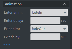 |
In the Animation Menu you can choose the enter and exit animation of your widget.
See more specified information about: Animation. |
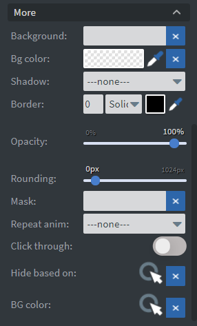
|
Under the Animation Menu you can click on the three dots which will show Additional Properties.
Here you can add a shadow and border to your widget. The Rounding and Opacity sliders, will change the transparency and round the edges of your widget. The Mask option will let you select a PNG image to affect the shape of your widget. You can also select a Repeat animation and delay that will play while your widget is showing. The Click through function allows you to click through the widget and interact with other widgets behind this one. |