RADIO BUTTON
Posted by 1 1 on
With the Radio widget you can create buttons that triggers actions or selects data entries in a form. |
|
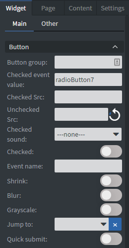 |
In the Button Menu you can set the name of your button group, an unchecked, and a checked value. See more about: Interactivity.
You can set your widget to be checked at the start of your content. You can set a Checked sound for the widget. You can upload a checked and an unchecked image here. You can also shrink, blur your widget, and make it gray scaled. You can also add a Jump to interaction. If the radio button is checked it will navigate to another page. The Event name is optional. You can turn on Quick submit. Whenever you click or touch the radio button it will collect the data and send out an email. |
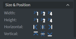 |
In the Size & Position Menu you can select the width, height, and placement of your widget quickly. See more specified information about: Size&Position. |
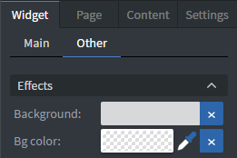 |
In the Effects Menu you can select a background image or color to your widget. |
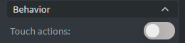 |
By enabling Touch Actions you can set up your own rules.
They can range from interacting with other widgets to calling APIs or navigating to other pages. Scroll down to Touch Actions since v1.6 to see more specified information about: Interactivity. |
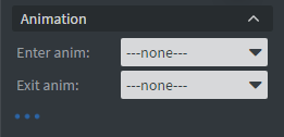 |
In the Animation Menu you can choose the enter and the exit animations of your widget.
See more specified information about: Animation. |
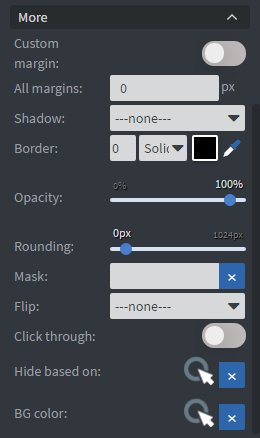 |
The Custom Margin switch allows you to set a custom sized margin to your widget.
You can set the opacity of your widget or you can mask it. You can also flip your widget horizontally, vertically, or both with the flip function. |